


Following the successful launch and adoption of the hub, the new challenge was to evolve the platform. With a rapidly growing library of content and a diverse user base, Patient Safety Learning needed to refine the user experience to ensure critical knowledge remained accessible, engaging, and easy to discover.
The challenge
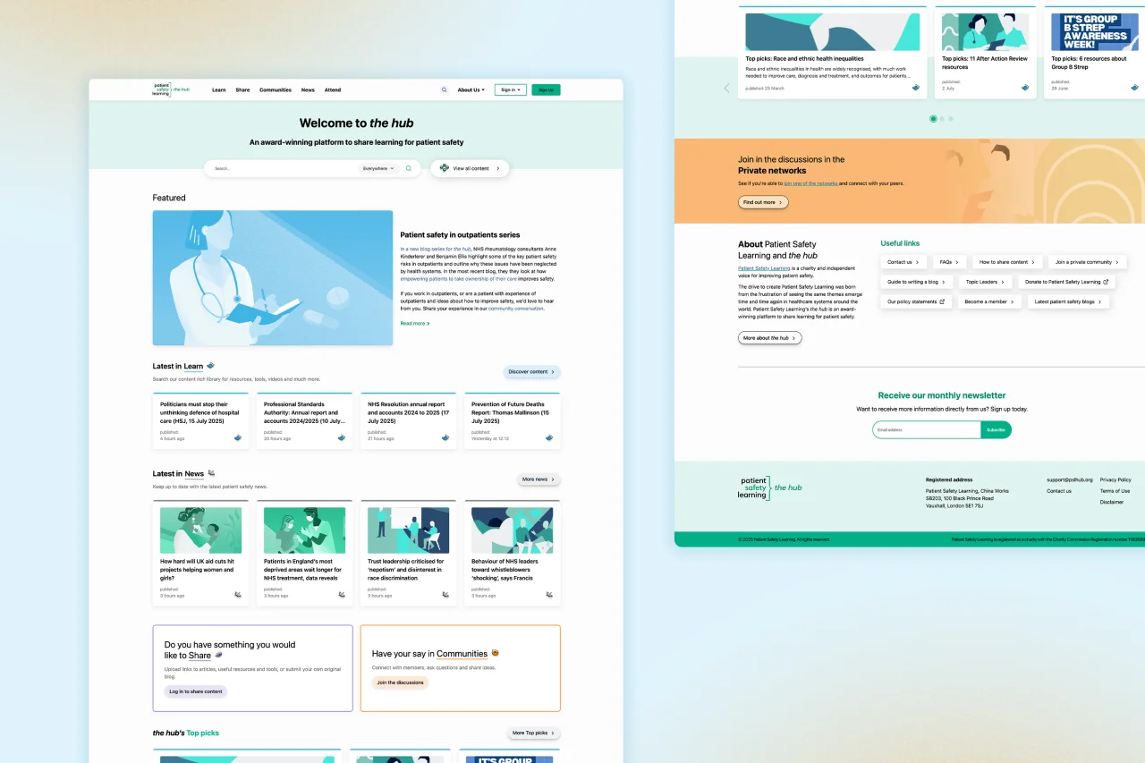
the hub was a victim of its own success. The sheer volume of content, while a testament to its value, had created several usability challenges. Brew Digital was tasked with refreshing the platform to address these issues while navigating significant technical constraints.
Through a collaborative Decision Sprint, we worked with the Patient Safety Learning team to identify what was working well and what needed improvement. This process surfaced several key challenges:
Design and Usability: The user interface lacked a clear visual hierarchy, making it difficult to distinguish between different content types like research papers and interviews. Key landing pages were cluttered, and a duplication of menus consumed valuable screen space, overwhelming users.
Search Functionality: The existing search was limited. Users couldn't easily search within whole categories, and the functionality within private community networks was not effective, making content discovery a significant pain point.
Content Categorisation: With a vast number of categories and subcategories, users often had to click multiple times to find the information they needed. Related content suggestions were often irrelevant, failing to guide users effectively.
A further complication was the platform itself. the hub is built on a heavily customised Invision Community platform. Any new design had to work within the existing development limitations and consider a major platform upgrade scheduled for the future. The goal was to design a solution that would solve today’s problems while acting as a bridge to the next version, avoiding a jarring change for users.
The solution
Our approach was rooted in data and a deep understanding of user behaviour. We began by analysing heatmaps to see precisely where users were clicking, informing our decisions on how to restructure the homepage to better meet their needs.
Following a lightning gallery exercise, where we identified elements of competitor sites the psl team admired, we created an initial ‘block plan’ structure. This foundational plan, backed by our research, was agreed upon with the client and guided the design process.
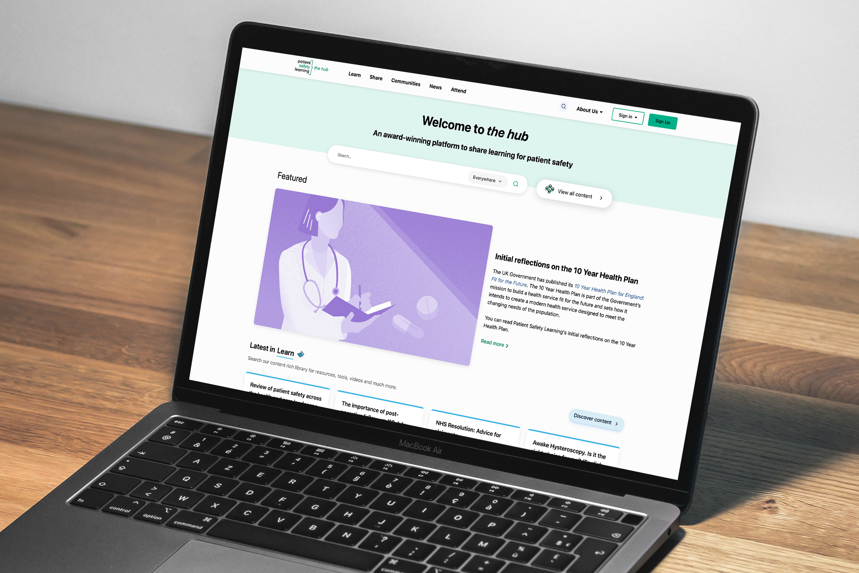
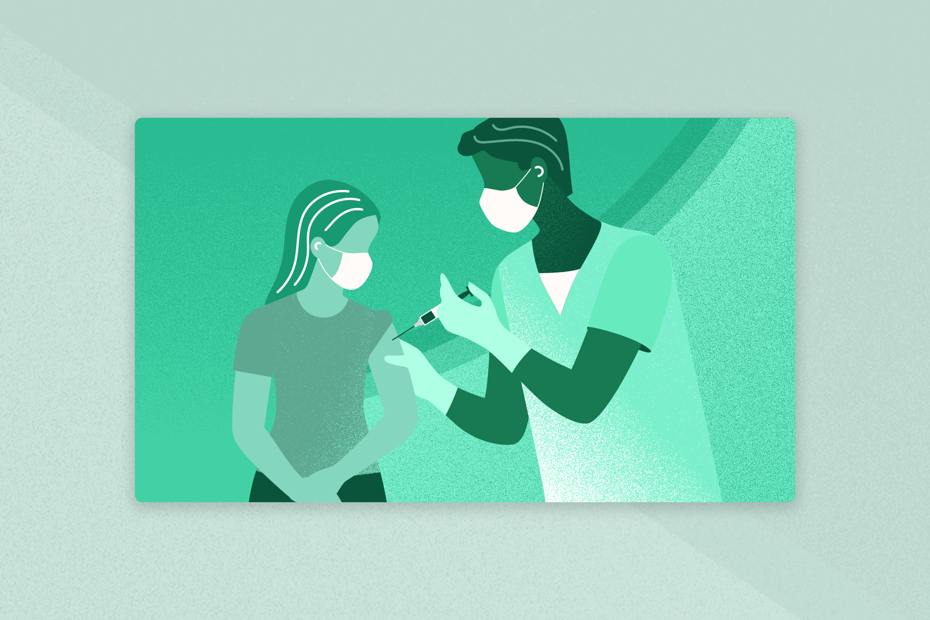
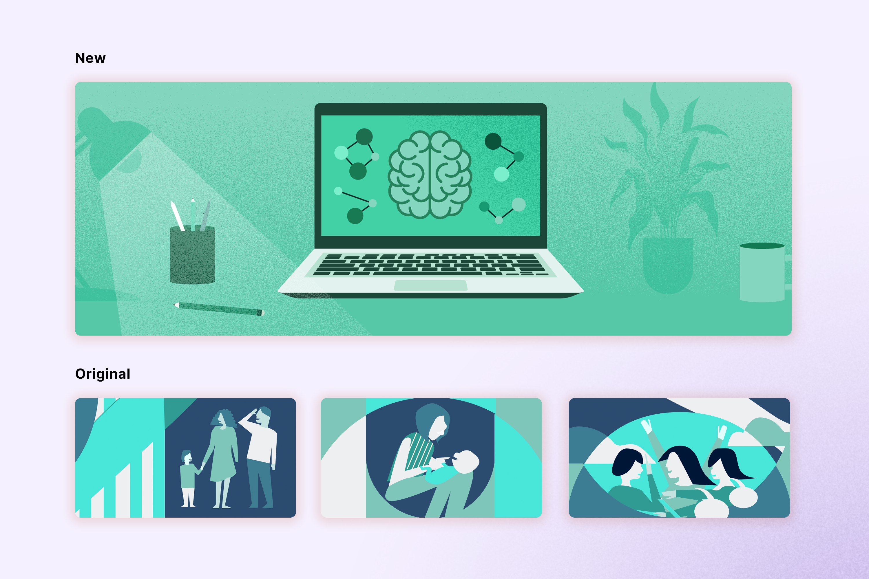
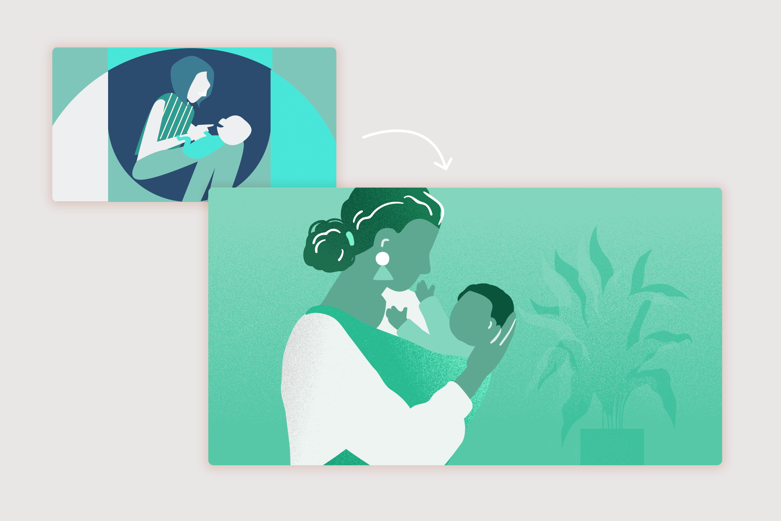
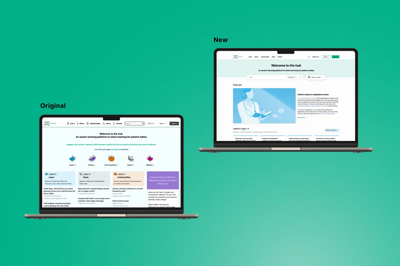
To address the core design and usability issues, we delivered a modern, intuitive interface. By leveraging Patient Safety Learning’s brand colour palette, we created clear visual distinctions between different types of content. The homepage was stripped back and decluttered, introducing dynamic ‘content cards’ to make information more engaging and digestible. To complement this, we designed a new bank of colour-coded illustrations, evolving the existing style to be more organic and approachable. This new asset library brings a fresh, modern feel across the entire website—not just the homepage—without requiring page-by-page development.
A key priority was making content easier to find. We moved the search functionality front and centre, placing it in the main navigation header to make it instantly accessible across the entire site. We also added a prominent search bar to the homepage hero banner and gave users the ability to search across all content or filter by specific types, dramatically improving discoverability.
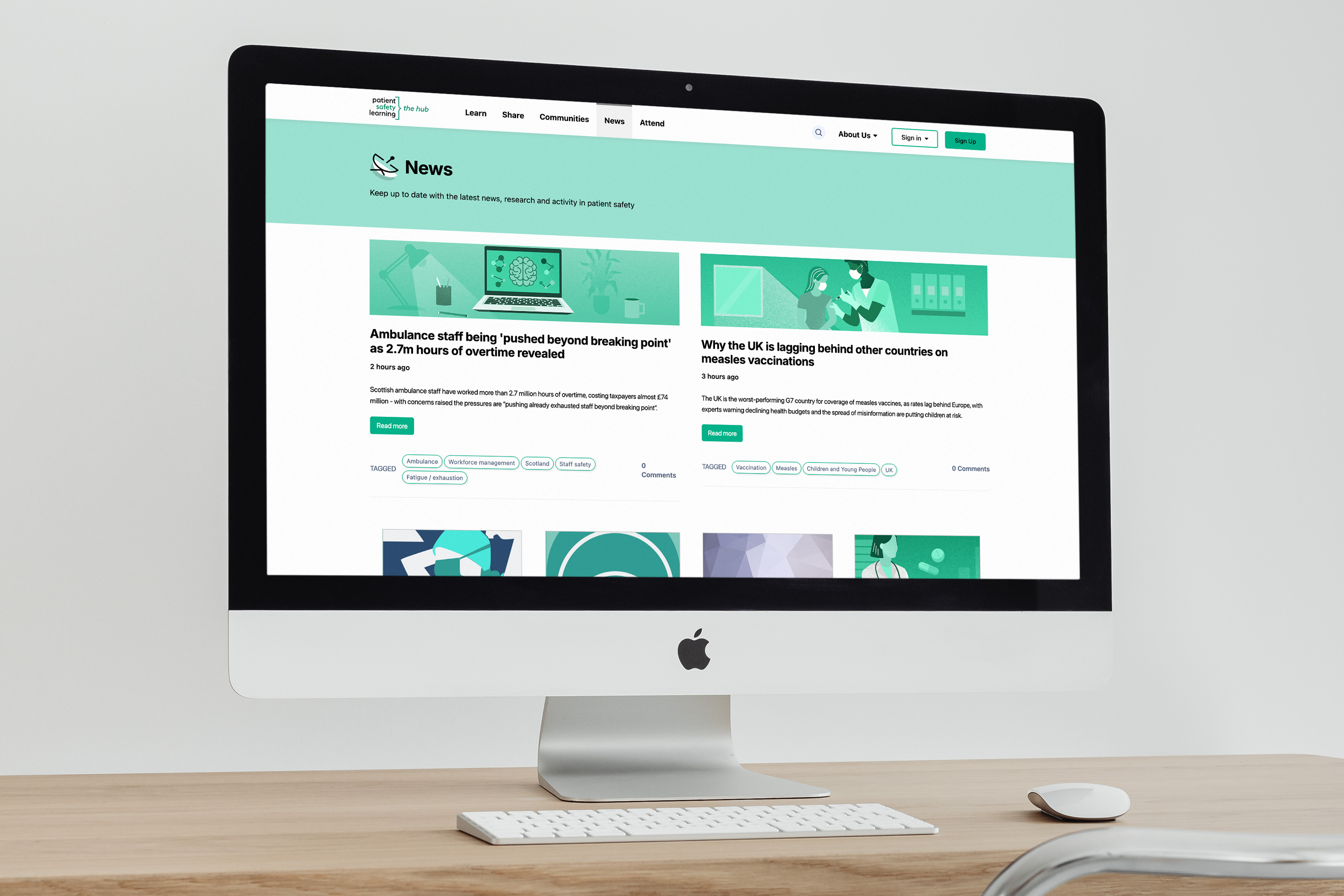
Finally, we addressed content categorisation by shifting the homepage from a long vertical list to a horizontal, card-based layout. This new structure prioritises key Learn and News articles before guiding users to other sections. For users belonging to private networks, we introduced bespoke feeds with the ability for admins to pin important content, creating a more relevant and focused experience.
The results
The redesigned hub launched smoothly with only a one-hour planned downtime. The project successfully modernised the platform's look and feel while delivering powerful new functionality that prepares the hub for its future evolution from Invision Community 4 to 5.
Key results include:
A modern and engaging user experience: A new look and feel was achieved through strategic design, colour-coding, and the introduction of a new illustration bank.
Improved discoverability: A simplified navigation and significantly enhanced search functionality allow users to find the content they need quickly and efficiently.
Enhanced accessibility: The refreshed design meets WCAG accessibility standards, ensuring the platform is usable for everyone.
Greater Admin control: The Patient Safety Learning team can now add custom notification banners to the site without needing developer support, enabling them to make timely announcements.
New private network functionality: Members of private networks now benefit from a bespoke content feed, improving engagement within these specialist groups.
Consistent Brand Experience: The visual refresh extended beyond the hub with a new, modernised HubSpot email template, ensuring a cohesive brand experience for users.
The client was delighted with the new designs, which have successfully balanced user needs with technical requirements, creating a platform that is both easier to use and manage.
What’s next?
We continue to work in close partnership with Patient Safety Learning. We will be monitoring user behaviour on the redesigned homepage via heatmaps and analytics to identify any further areas for improvement. Together, we will continue to evolve the hub, supporting Patient Safety Learning’s vital mission to improve patient safety in the healthcare sector.